Resume
Back to Projects
Intro
Overview
Previous Issues
Final Deliverable
other Projects

GROUPWARE 2

Internal Communications Software

FAUX  PROS

League of Legends Proof of Concept

Groupware 2

Groupware 2 (GW2) is an internal multi-purpose commucations software that Binex Line Corporation uses as part of its daily operations. The software handles everything from submitting invoices, approving or canceling employment related issues, requesting PTO and business trips, and more.

I worked with the IT department to redesign the old version of the software to improve usability, simplify processes, and decrease reported user confusion.
Role
UX Designer
Timeline
3 Months
Skills
UX Design
Research
Problem-Solving
Tools
Figma
Claude Design

Faux Pros

Faux Pros is a conceptual game mode that offers a fun and challenging learning experience for all range of players, where they challenge highly trained AI bots. It's designed to help players identify and address their in-game mistakes, ranging from minute champion mechanics to the big picture game strategies.

I conducted interviews to identify the initial problems, and used the data gathered to design wireframes that can be integrated into the game's client. Users can select their opponents, alter the game settings, and view their in-game mistakes.
Role
UX Designer
Timeline
5 Months
Skills
UX Design
Research
Visual Design
Wireframing
Tools
Figma
Miro

Project Overview

One of GW2's main features is to submit important documents ranging from invoices to shipping labels. Most of the reported problems were about the process to submit those documents and the clutter of the poor design language in place.
The problem is that...
Our software was plagued with redundant workflows and poor visual design language that lowered the user experience of the company employees. There were significant reports of employees getting stuck submitting tickets and navigating the menu to submit these documents.
...so our solution was
A redesign of the old software, where we combined unnecessary steps into one single workflow as well as bolstering our visual design language to better surface important information.
Key Features of the Redesign
Simple Workflow - Utilized progressive overload principles to combine multiple steps into one page
Clear Visual Hierarchy - Easy to see who submitted a document and who needed to approve
Clean Design Language - Cleaned up text boxes, better fonts and colors, and better spacing between elements

Project Overview

I tasked myself to design an in-game learning resource that could fit seamlessly into the existing client. I considered the resource's capabilities, adhering to the game's design language, and the resource's enjoyability.

This project included concept development, market analysis, wireframing, and user interviews that involved a moderated environment for brainstorming and analysis.
The problem is that...
League of Legends is a popular online game where players control characters with unique abilities on a battlefield. Despite its success, the game still lacks a robust learning resource, leaving players to discover their mistakes through trial and error, often leading to frustration...
...so my solution is a
Fun and challenging game mode that identifies mistakes and offers corrections by battling pro-level AI bots.
Key Features
Fine Tuning - Players are offered a multitude of training settings they can control to maximize the game mode's effectiveness
Identify Mistakes and Insights - Faux Pros analyzes gameplay and offers actionable solutions to frequently made mistakes.
Rewards Players Who Improve - A rewards shop (coming soon...) offers in-game rewards to incentive players who correct their mistakes.

Previous Issues

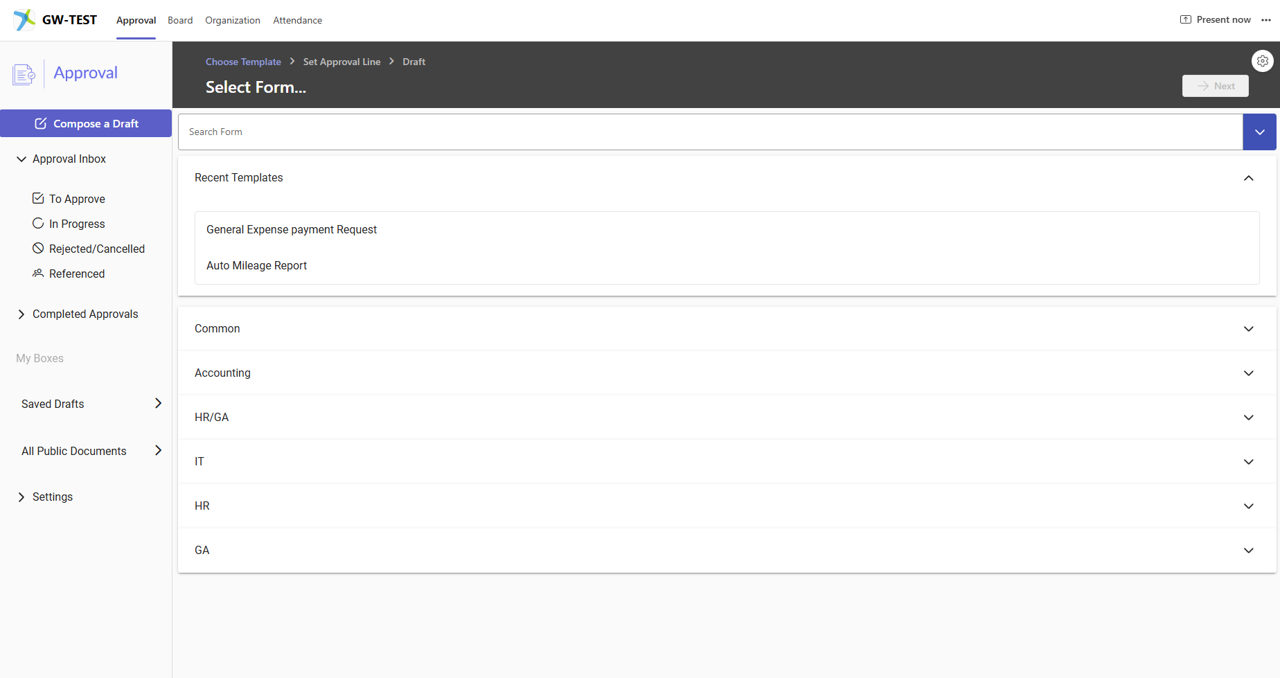
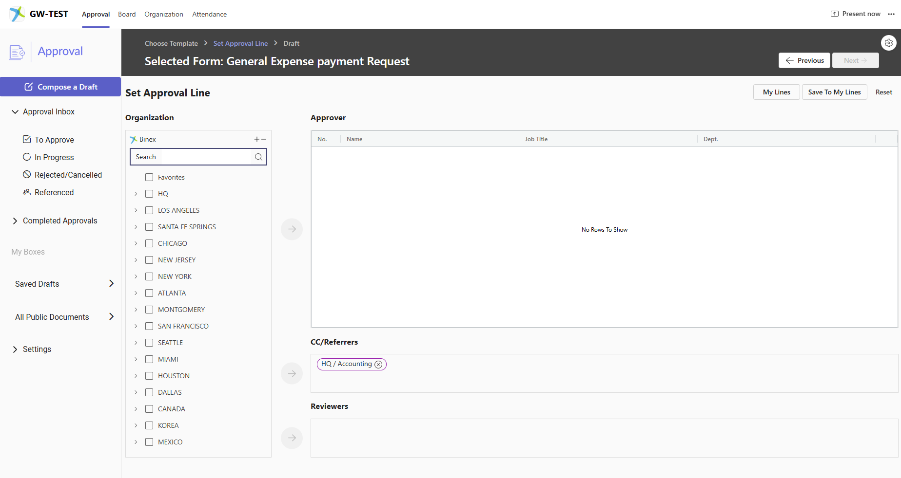
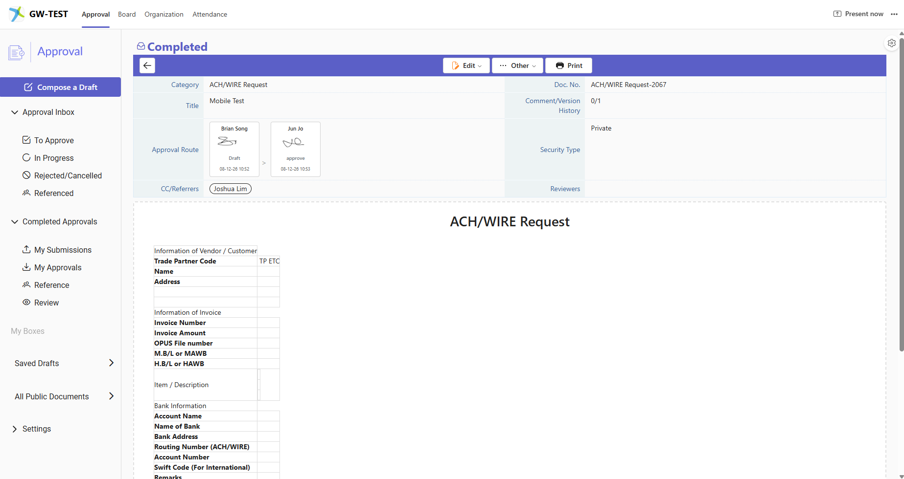
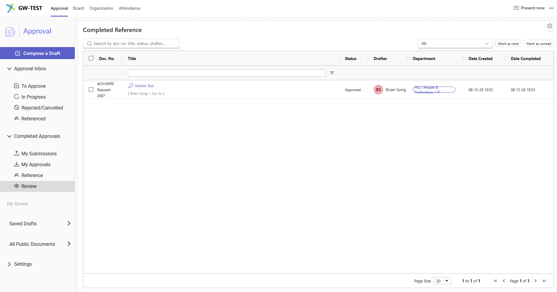
1. "Compose a Draft" workflow was unintuitive and had one too many steps
Users had to select the form they wanted to use, and then head up to the top right corner to go to the next step. There was also an excessive use of empty space.
Users needed to set an approval route so that all submitted documents can be reviewed by their supervisors. However, the UI and workflow to set an approval route was confusing for many.
2. Unclear Information Hierarchy
GW2 is naturally information dense, but it was all dumped onto the screen without proper order, grouping, and hierarchy to show the most important information needed first.
3. Poor Visual Design Language
Typography system was inconsistent for each element, pills were poorly sized, and information often overlapped and prevented users from clearly reading the information.

Final Deliverable:
Redesigned GW2

We have currently deployed the updated GW2 across our company since August 1, 2026, and we have reported a significant decrease in user reported errors. The team will closely monitor the performance of GW2 as time passes and we gather more data from users to see if the changes are long-term.
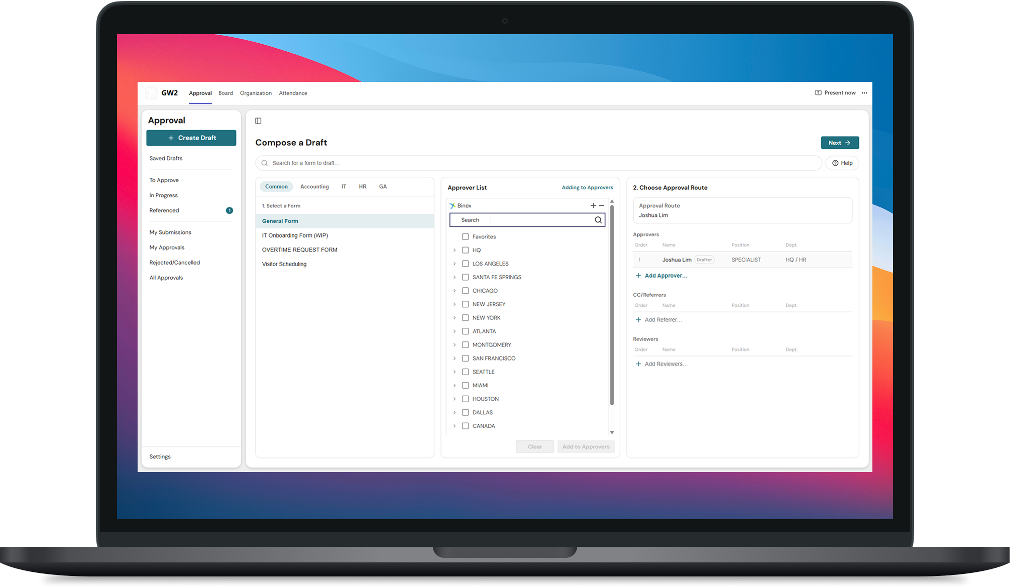
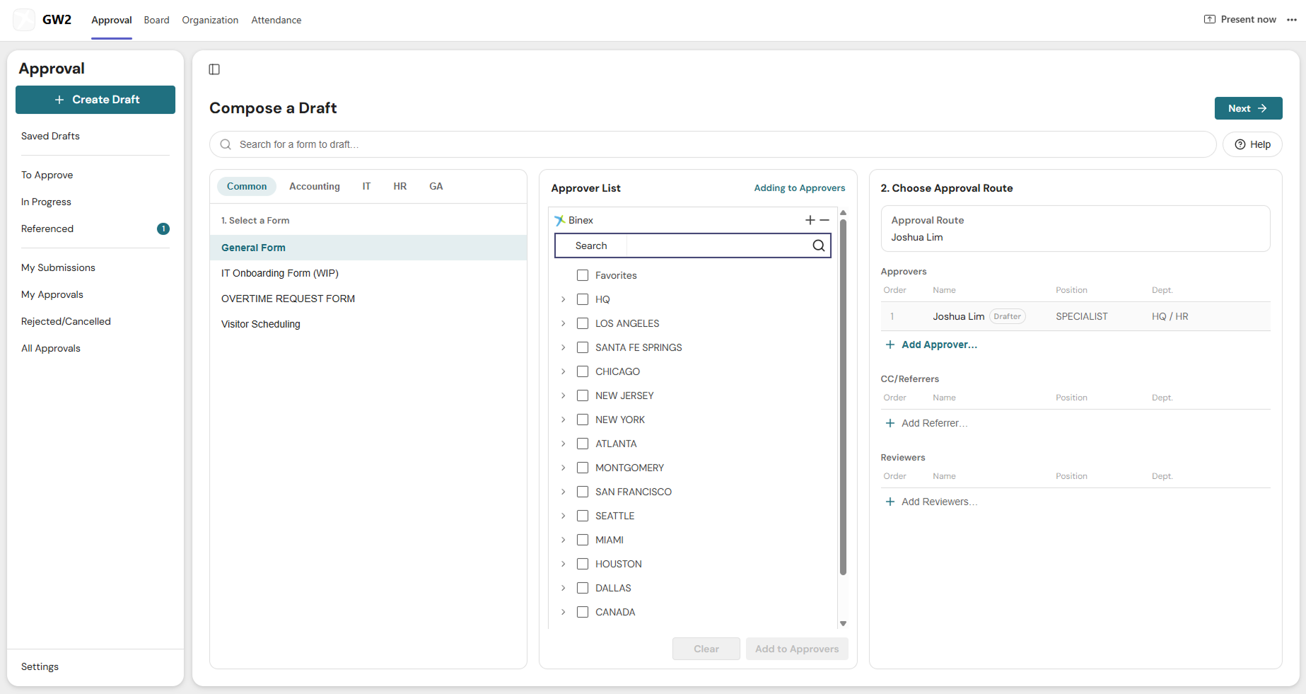
1. Condensed "Compose a draft" into one page
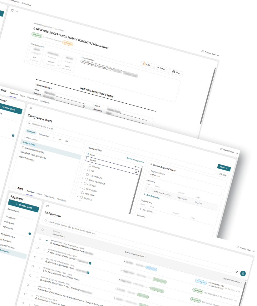
Once users select a form, the approver's list is visible. Users can easily select and choose their approval route, and can visibly who needs to approve their submissions. This improved users' ability to understand how the work flows, and reduced the number of users giving up during the process/asking IT for help.
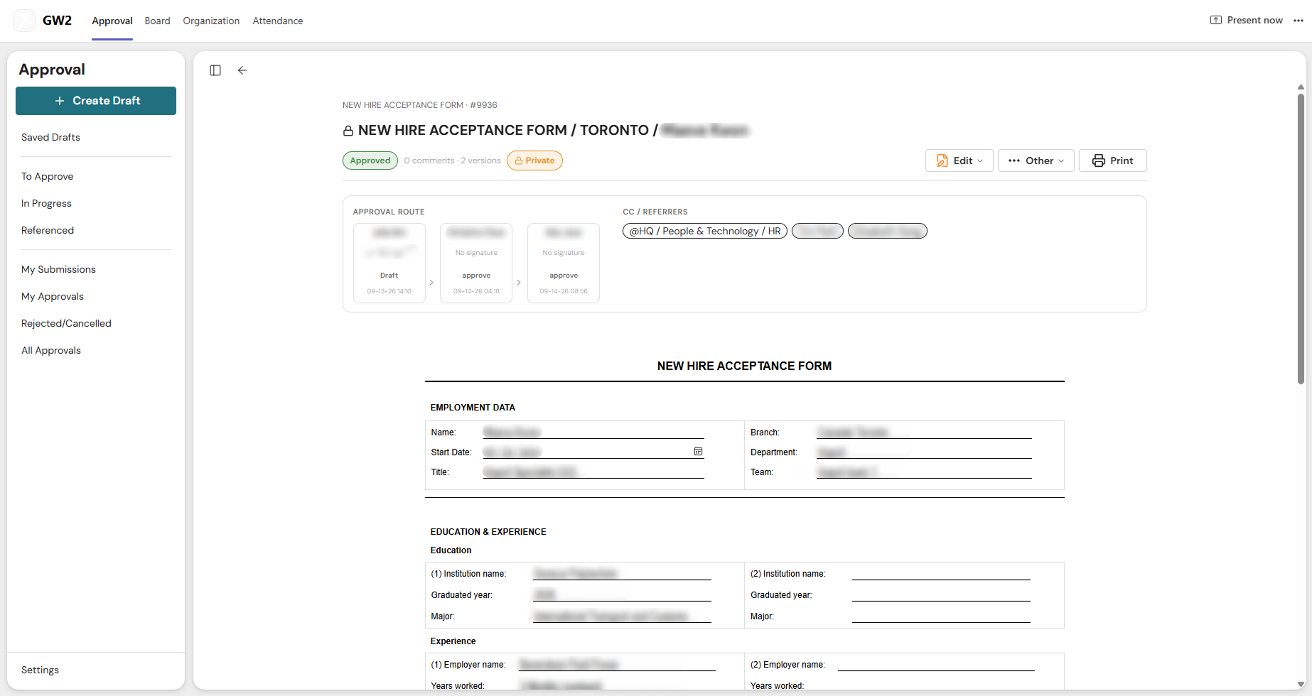
2. Condensed Information and surfaced important content
We condensed the draft menu into an easy to digest section where users can see the submission status and who needs to approve, giving users clear understanding of where they are with their submissions.
3. Streamlined and sharpened design language
I set up a typography and color system in place to make the software easier to scan and parse through. Good spacing between elements made it easier for users to make clear distinction between important information, increasing user satisfaction.

Other Projects